
O'Neill
Increased conversion rate without drastic changes to the webstore

Hypothesis
Removing the 'quick checkout' option from the flyout and guiding users to checkout via the cart would create a more logical flow, leading to a higher conversion rate.
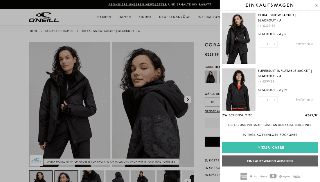
Changes Made
Removed the "Go to checkout" button from the flyout
Restyled the "View cart" button (turquoise, previously used for the checkout button)
Outcome
The number of conversions significantly decreased. From this, we learned that the quick checkout plays an important role for users. It led us to suspect that the cart flyout is perceived as a fully functional cart by users. This insight led to a follow-up test to verify our assumption.
Hypothesis
The cart overlay is perceived as the actual cart. Removing the additional step from the cart overlay to the cart page improves the user experience and results in a higher conversion rate.
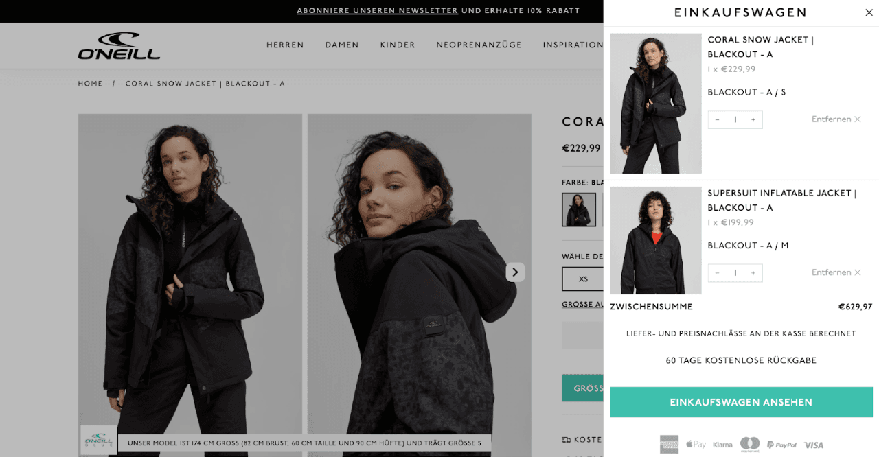
Changes Made
• Removed the "View cart" button from the flyout (leaving only "Go to checkout" as an option)
• Clicking the cart icon in the header now leads directly to the full cart page, not the flyout
• The flyout only appears when a product is added to the cart
Results Conversion Uplift:
• Germany: +6.8% (significant)
• Netherlands: +8.4% (significant)
• UK: Inconclusive, no significant effect
Overall: +4.7% uplift in conversions across all three countries (significant)
About O'Neill
O'Neill is a surf-inspired brand rooted in California. Known for their innovation in wetsuits and beachwear, perfect for life on and off the waves.
Stay ahead in marketing and Tech
Ready to make real impact? Let’s connect.
